No, you didn’t just wake up from a coma. It’s not Christmas time, but you might want to start thinking about your next holiday card and message.
Here at LKF Marketing, the planning for our annual holiday greeting starts early. Like September early. Each year we are challenged to outdo the previous year’s offering while balancing the opinions of 15 experienced marketing professionals; show off our work hard, play hard culture; and send sincere wishes for a happy holiday season.
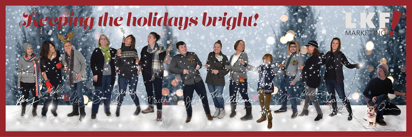
We think we nailed it with our 2018 holiday card!
Our design process began with brainstorming involving the entire staff. Eventually, the concept of “Keeping the Holidays Bright” rose to the top and a vision formed of the entire staff – including our programmer who works from New Mexico and then intern – wrapped up in holiday lights.
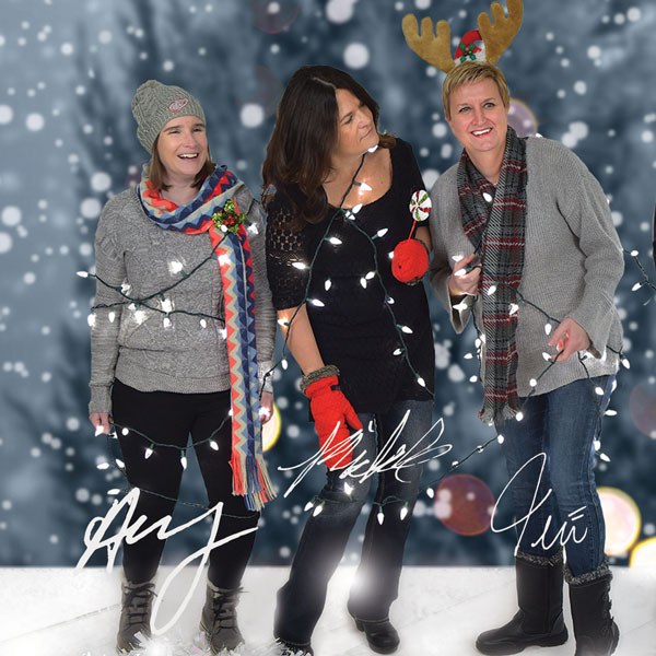
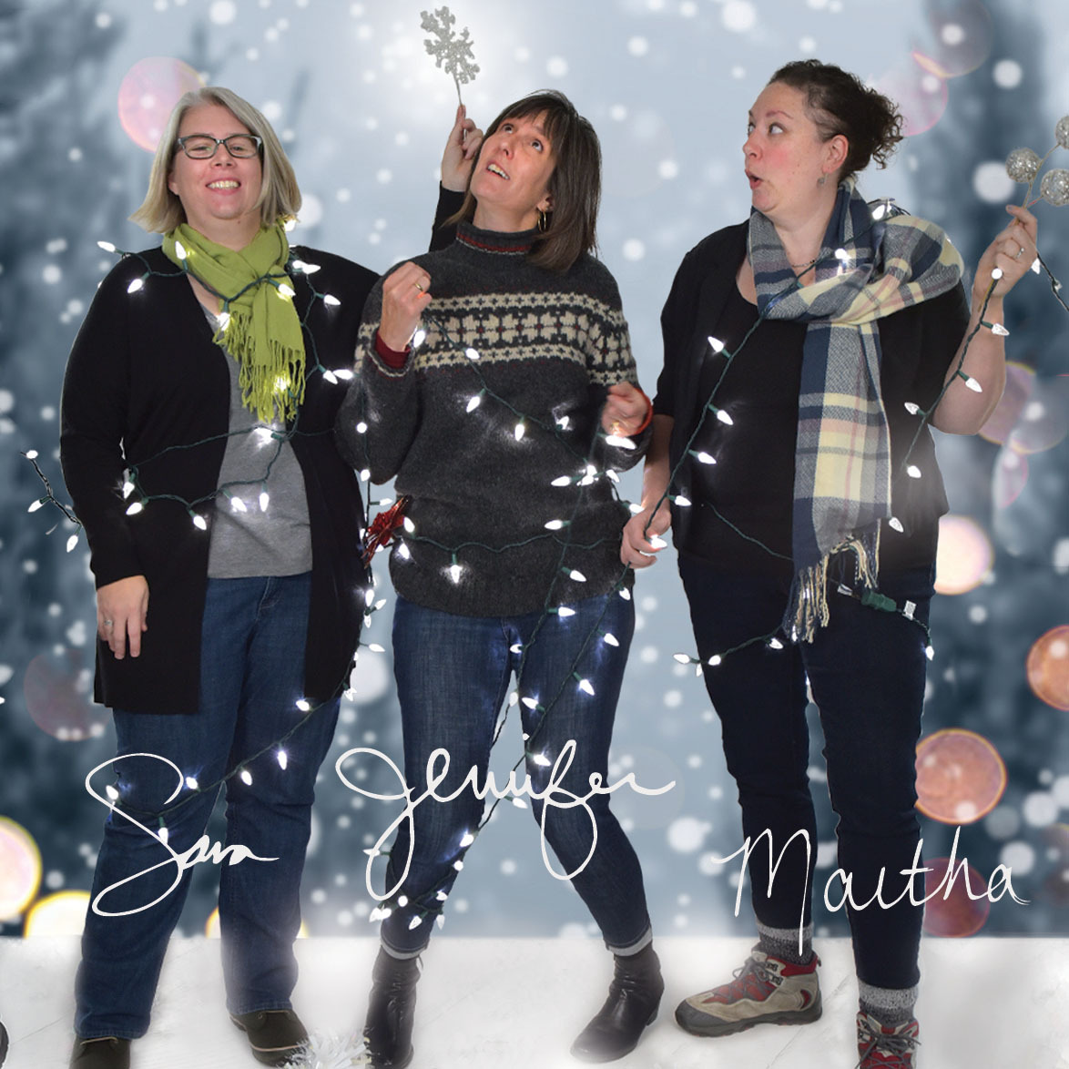
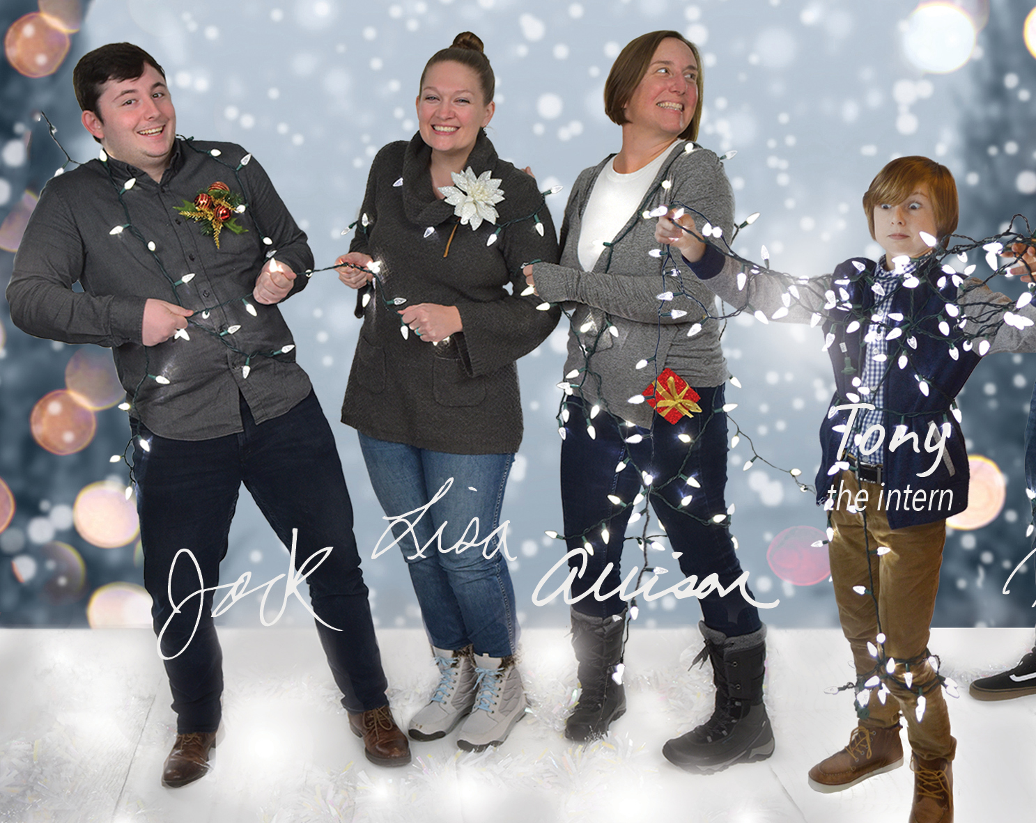
We hired a photographer to capture images of our staff in small groups in front of a white sweep with lights extending to either side of the group. Images were sorted and selected on how they would interact all together. All images were photoshopped to remove the background and to combine the small groups into one large group. A background image was selected to set a wintery scene behind the combined group.
After the photoshop work was completed, the creative team further brainstormed and decided to pursue a unique paper printing solution to accentuate the light and sparkly message and visuals (because print is not dead). We approached one of our long-time vendors and owner of River Run Press (River Run), Al Higdon, for a print sample on a sheet of the silver paper.
Based on the sample we received from River Run Press, we knew we would have to print a white layer between the background image and anything that we wanted to show up clearly in printing. Printing to silver paper results in a dark muted result; a white layer on top of the silver paper allows one to print on the paper’s surface while maintaining image visibility.
LKF’s 2018 holiday card includes a solid white background behind the staff and floor where we’re standing. Additionally, there is a white gradient that starts at 50 percent white at the top of the page to 0 percent white a third from the top of the page. This enabled us to print a phrase on the card without losing it to the silver paper yet not have it look like it was floating above the dark background.
The silver knockouts (as seen in the word “LKF” and the signatures) are achieved by leaving negative spaces in those areas. Lighter colors in the background were softened with the presence of mostly transparent layers of white. The red shiny border and typography were achieved by printing red directly to the silver paper.
Al and the team at River Run were great partners and integral to the success of the project. He printed four or five trials of the card to help us dial in the design and its execution.
In addition to the printed cards, we also created a corresponding enews, landing page, and social media posts based on the same theme.
So how about you and your organization? Do you need a way to communicate your culture and uniqueness in a printed or digital format? We’d love to help!
Contact us to view additional holiday card projects we’ve created and start a conversation about your 2019 holiday greeting!

