Menu Search

Nothing lasts forever; Fibers tapped LKF when for a new look.

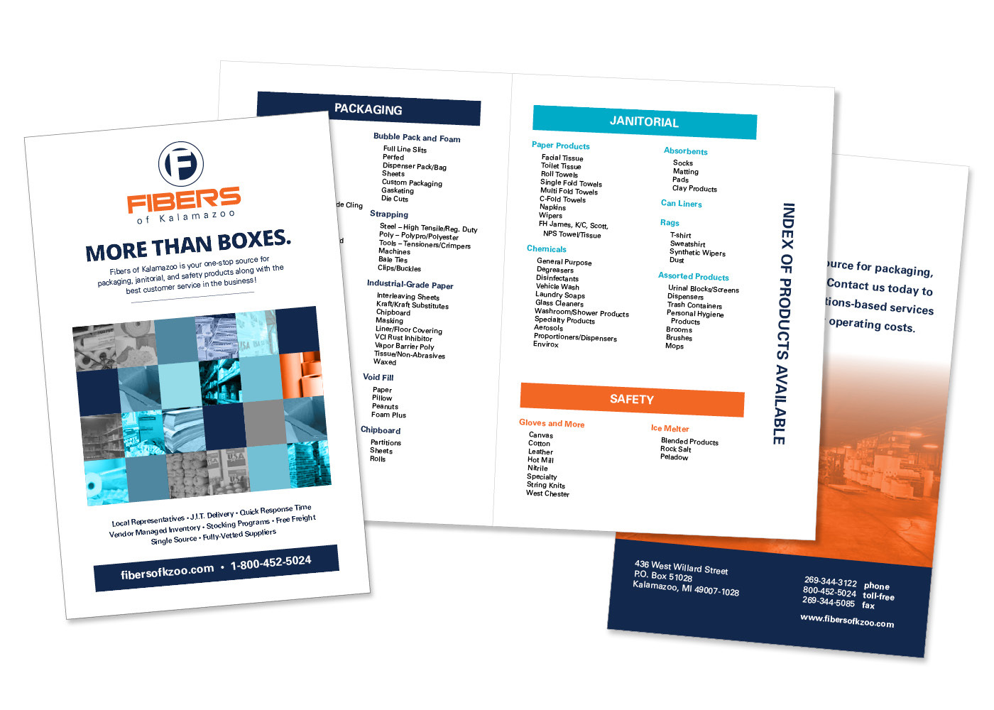
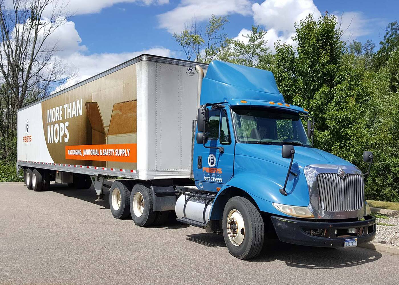
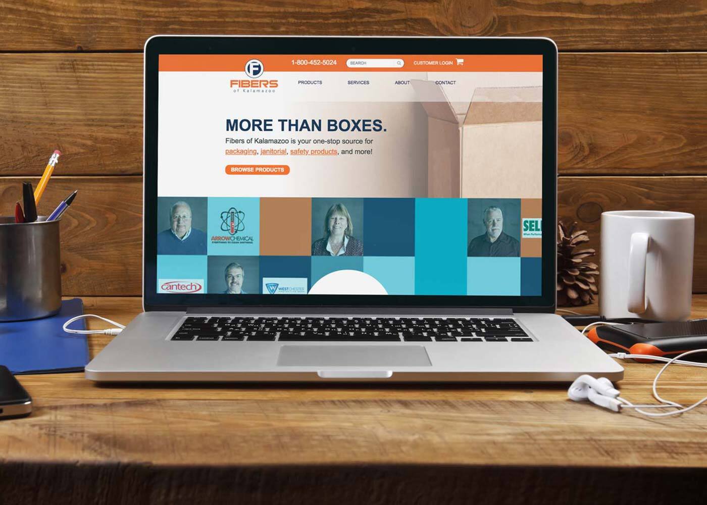
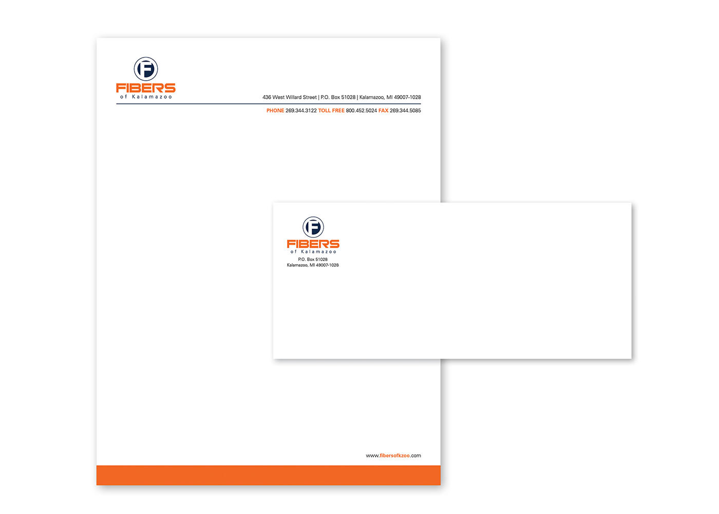
Fibers of Kalamazoo (Fibers) started as a paper converting business in 1981. Since then their offerings have evolved to include janitorial and packaging supplies. Accordingly, Fibers opted to update their logo to reflect the current state of the business.

The new logo needed to be iconic yet general since representing the wealth of Fiber's offerings - from safety gloves to rock salt - could not be easily conveyed in a single design. The finalized design is a stylized "F" with bold font treatment emphasizing the "Fibers" portion of the name. "of Kalamazoo" is still included, but not highlighted as heavily since the business' reach has increased significantly since its inception.

LKF also worked with Fibers to define their corporate colors.

Services Provided

Account service, competitive analysis, graphic design, strategic planning

Contact LKF

Fibers of Kalamazoo Work

View All
  • Fibers of Kalamazoo logo
  • Fibers of Kalamazoo brochure
  • Fibers of Kalamazoo vehicle graphics
  • Fibers of Kalamazoo website
  • Fibers of Kalamazoo collateral materials

Identity Work

View All
  • 633 Group partial logo
  • AC Insights Identity Gallery closeups
  • City of Kalamazoo River's Edge logo
  • Connect Battle Creek logo
  • Envirologic Technologies logo
  • Fibers of Kalamazoo logo
  • Gull Lake Dam Association Logo
  • Haymarket Plaza Logo
  • kresa-career-connect-detail-1080x1080
  • Kehoe Martial Arts logo
  • Kessenichs logo 1080x1080
  • KzooConnect logo
  • MCM logo
  • Michigan craft beverage barrel 1080x1080
  • Miller-Davis Company logo
  • The Montessori School logo
  • Parchment School District logo
  • Premier Radiology logo
  • Treystar The Foundry logo
  • Trust Shield Insurance Group logo
  • Welsh wire logo identity 1080x1080
  • Allegan WOHH identity 1080x1080