Menu Search

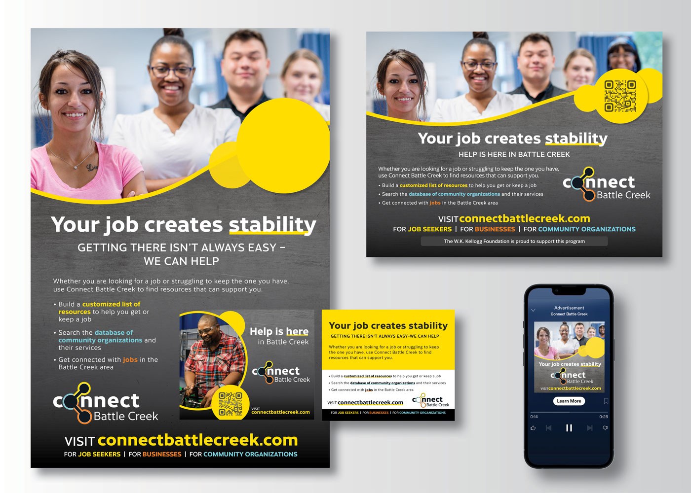
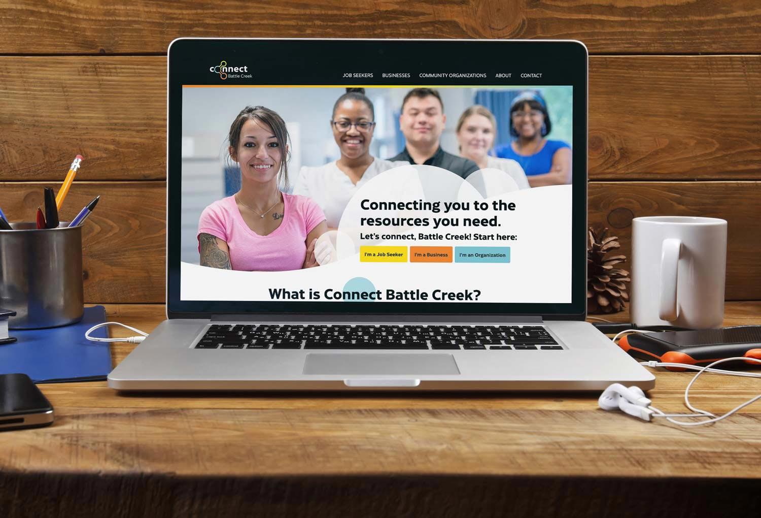
Connect Battle Creek's website needed a logo showing its role in the community.

Before creating the Connect Battle Creek website, we needed to design a logo that would reflect the purpose of launching the site, which was to help improve awareness of the variety of workforce system resources available to job seekers and businesses in Battle Creek.

The logo features three circles of different colors representing the three groups that Connect Battle Creek brings together: job seekers (orange), nonprofit organizations (blue), and businesses (yellow).

Services Provided

Account service, competitive analysis, graphic design, vendor management

Contact LKF

W.E. Upjohn Institute of Employment Research Work

View All
  • Connect Battle Creek Job Seeker Campaign
  • CBC Homepage
  • CBC Identity connect battle creek logo 1400x1000
  • Connect Battle Creek Experience Nurses Video
  • WEUP i Phone mockup 1400x1000
  • Plan4 WEUP Best Practices Page 1400x1000

Identity Work

View All
  • 633 Group partial logo
  • AC Insights Identity Gallery closeups
  • City of Kalamazoo River's Edge logo
  • Connect Battle Creek logo
  • Envirologic Technologies logo
  • Fibers of Kalamazoo logo
  • Gull Lake Dam Association Logo
  • Haymarket Plaza Logo
  • kresa-career-connect-detail-1080x1080
  • Kehoe Martial Arts logo
  • Kessenichs logo 1080x1080
  • KzooConnect logo
  • MCM logo
  • Michigan craft beverage barrel 1080x1080
  • Miller-Davis Company logo
  • The Montessori School logo
  • Parchment School District logo
  • Premier Radiology logo
  • Treystar The Foundry logo
  • Trust Shield Insurance Group logo
  • Welsh wire logo identity 1080x1080
  • Allegan WOHH identity 1080x1080